(source: TGI Colombia, IBOPE Colombia)
Demographic Profiles
of
Radio Format Audiences
Marketing research often begins with the collection of data through surveys. The data are often displayed in the form of data tables, most typically in the form of a cross-tabulation of one set of variables in the columns and another set of variables in the rows for the purpose of studying the interrelationships between these two sets of variables. This is the bread-and-butter of marketing research.
When the dimension of this table is small, it is easy to comprehend what is going on. When the dimension of the table is large (say, 12 columns by 28 rows), it becomes much more difficult to comprehend. The marketing research analyst understands what is happening in any cell of the data table and the relationship with some other cell. But it is difficult for the human mind to comprehend the totality (not necessarily in the Lukacsian sense) of the entire table.
In recent years, marketing researchers have increasingly made use of graphical methods to summarize data tables. Whereas humans typically approach large tabulations one or two cells at a time, the human can grasp the multiple meanings in a graph much more easily. As Edward R. Tufte says, "Graphical excellence is that which gives to the viewer the greatest number of ideas in the shortest time with the least ink in the smallest space." To demonstrate this point, we will use some survey data from the TGI Colombia study. This is a consumer survey of 7,035 persons in Colombia conducted by IBOPE Columbia during 1999. The TGI Colombia study covers demographics, media and product usage, from which we will look at a data table of age/sex by radio program types.
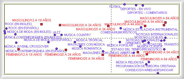
This table has twelve columns for age/sex groups (male 12-19, male 20-24, male 25-34, male 35-44, male 45-54, male 55-65, female 12-19, female 20-24, female 25-34, female 35-44, female 45-54 and female 55-64) and 28 rows for the various radio formats. We use the method of correspondence analysis to produce a two-dimensional map as shown below.

(source: TGI Colombia, IBOPE Colombia)
The correspondence analysis yielded the following graphical representation of the age/sex groups: along the horizontal axis, the groups are sorted by age, with the youngest people on the left and the oldest people on the right; along the vertical axis, the males are on the top half and the females are on the lower half. This graphical representation was created purely on the basis of the radio listening preferences of the survey respondents, as the algorithm has no semantic understanding of the meanings of the labels (such as males 12-19). Thus, the natural age/sex structure was revealed by the algorithm purely from the data structure.
In the same map, the radio formats fall into the quadrants where one would expect them to be. For example, rock music falls with males 12-29, advice/variety/family with older females, and sports with older men. The arrangement is very much in line with our expectations. The radio industry was never about building mass audiences. If 15% of the people listen to radio at any time, then the average rating in a city with 50 radio stations would be 0.3%. However, this 0.3% is often sharply defined in terms of age/sex demographics, meaning that it could be 2.5% among males 20-24 and near zero for other groups by virtue of the station's carefully defined format type. This correspondence map was able to represent the structure of the radio industry simply from the set of survey responses.
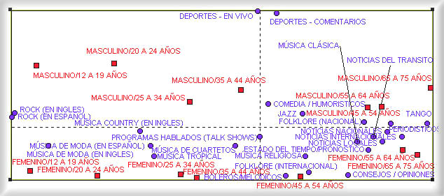
For comparison, we also looked at a similar data table from the TGI Argentina study. This is a study conducted by IBOPE Argentina in Argentina during 1999. The list of radio formats in TGI Argentina is slightly different, due to cultural differences between Colombia and Argentina. For example, we have tango and bolero in Argentina but not in Colombia. The data table consists of 12 age/sex groups and 26 radio formats for 3,216 respondents.

(Source: TGI Argentina, IBOPE Argentina)
This correspondence map has an amazingly similar structure to the one for Colombia. This type of structure for the radio industry is therefore common within these two countries and, we suspect, in many other countries all over the world as well.
Technical footnote
The most accessible description of correspondence analysis is this book: Michael
Greenacre (1993). Correspondence
Analysis in Practice. Academic Press: New York.
(posted by Ivan Galvis & Roland Soong on 11/26/99)
(Return to Zona Latina's Home Page)